
Telcor: From buried conversions to persona-driven strategy
Telcor, a national leader in laboratory billing software, was watching the wrong numbers move. Their site recorded 57,000 sessions over 11 months, but a 70% bounce rate sent most of them away in seconds. Average engagement time was 32 seconds. Mobile traffic sat at 19%, well below the 30–50% norm for SaaS healthcare. The Contact page, the single most important conversion endpoint on the site, was converting at 2.68%, somewhere between one-quarter and one-eighth of the 10–20% industry benchmark for high-intent SaaS traffic.
The interface looked outdated next to competitors like XIFIN, Quadax, and Siemens. CTAs read "Learn More" and "Read More", generic, low-intent language for a B2B SaaS audience that does not have time for vague invitations. There was no clear path through the site for the four distinct personas making buying decisions: laboratory billing executives, CFOs, POC coordinators, and lab directors.
Nothing was obviously broken. The site was leaking, quietly, persistently, and structurally at every stage of the journey.
The problem wasn’t traffic. It was clarity at the moment it mattered.
Telcor wasn’t struggling to get visitors. They were losing them before trust could form. In the first few seconds, users couldn’t quickly understand what the product did, who it was for, or why it was different. That uncertainty compounded across the experience, from generic calls to action to unclear paths for key decision-makers. When a site forces users to think this hard, especially in a high-stakes B2B environment, they leave. Not because the offering lacks value, but because the value isn’t immediately visible
What changed
Six structural shifts, every one of them defended by data:
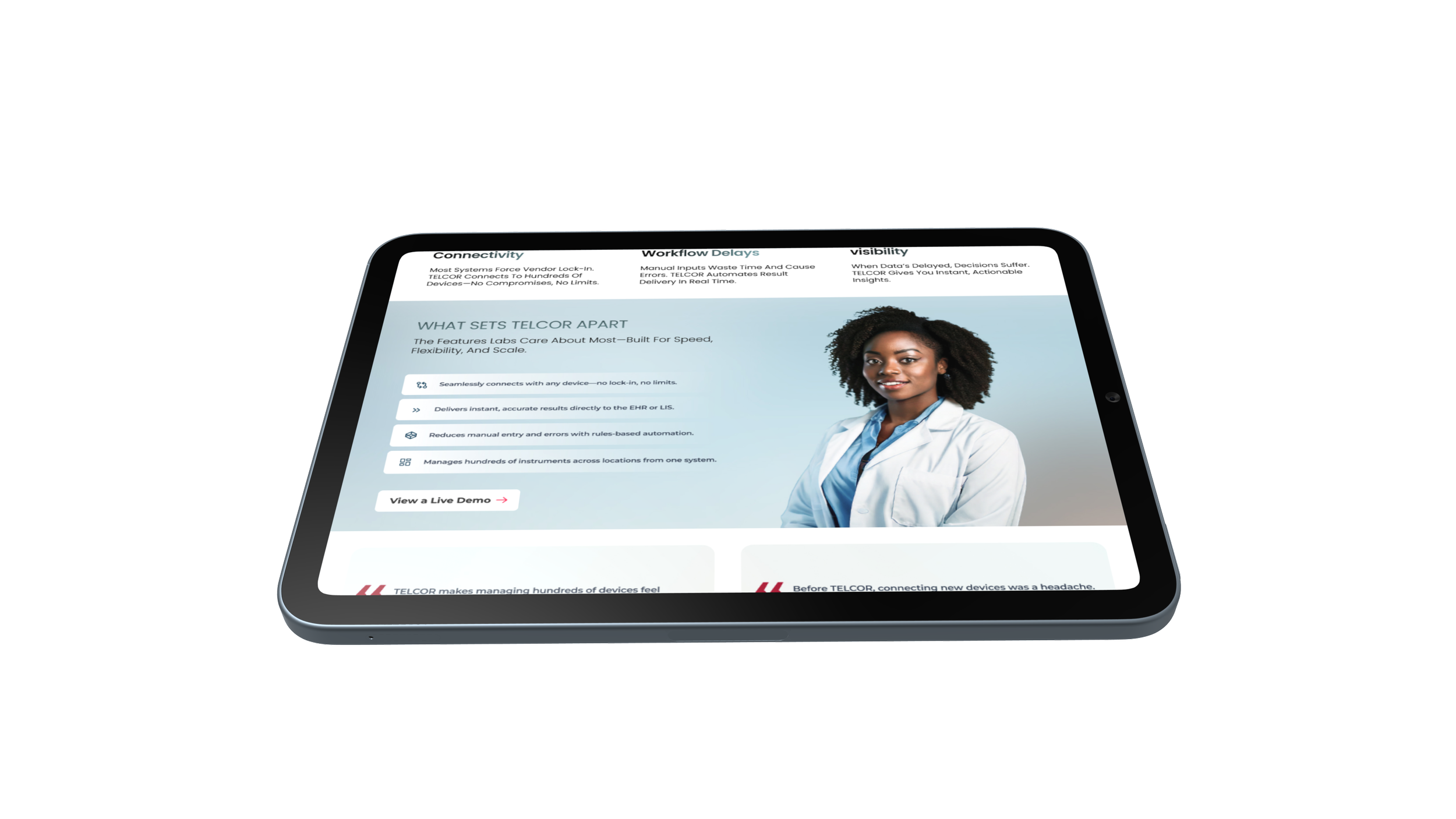
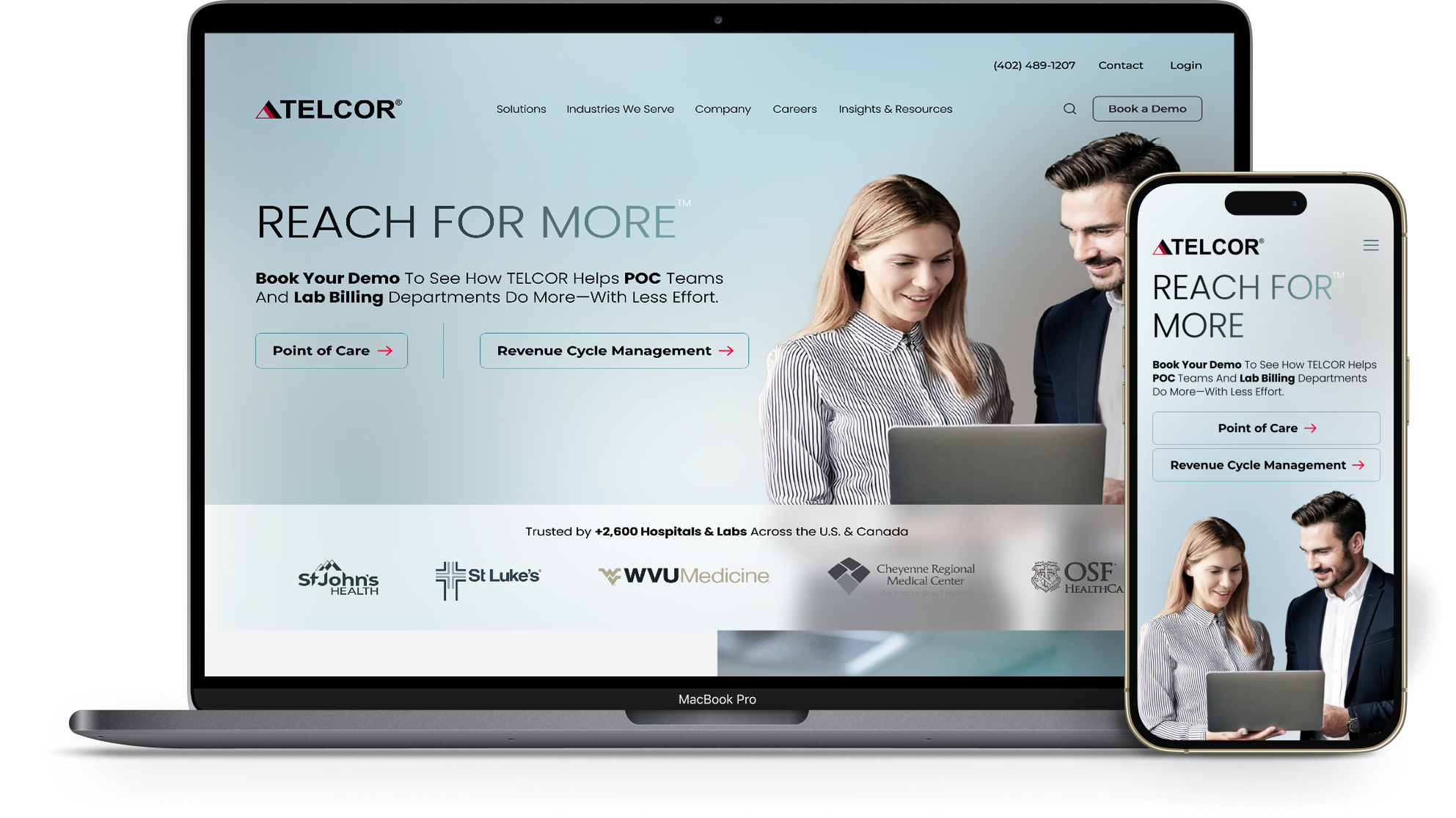
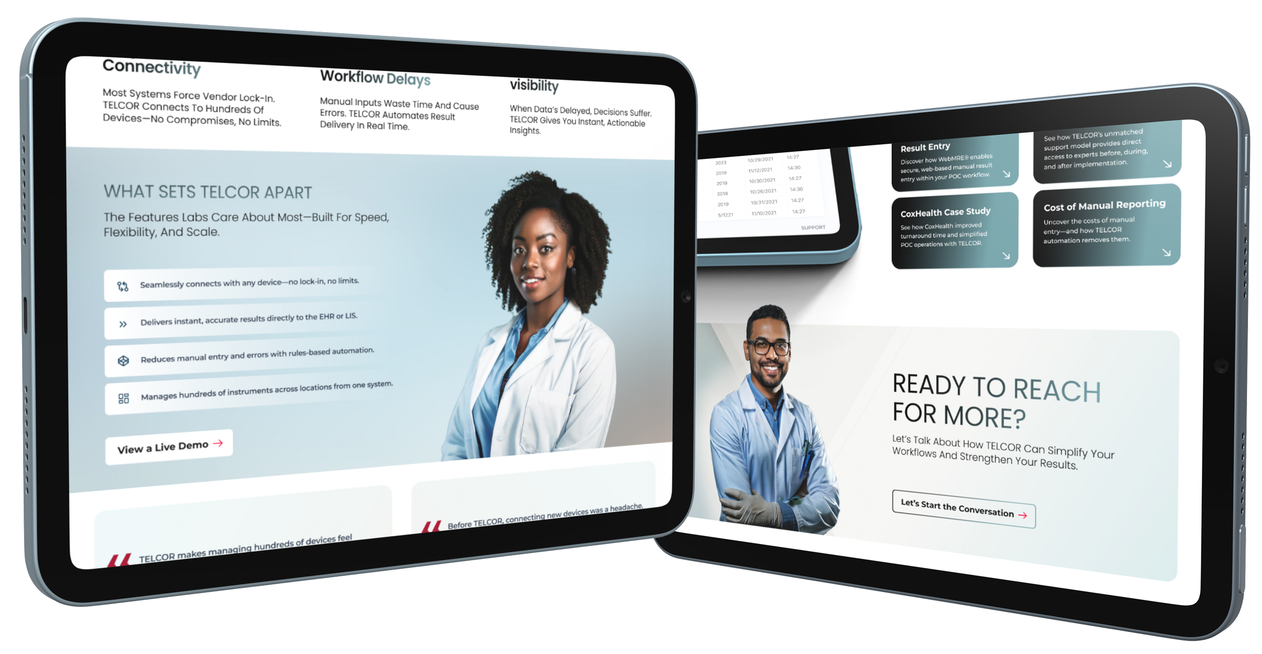
From vague messaging to persona-clear positioning. Above-the-fold copy now states who Telcor is, what each product does, and which audience it serves — orienting visitors in seconds instead of minutes.
From generic CTAs to intent-driven action. "Learn More" became "Explore RCM Tools," "See How We Boost Collections," "Watch a 2-Minute Demo." Every button does conversion work.
From buried trust to surfaced proof. Customer testimonials, client logos, and outcome stats — 6–12% collections increase, 95% electronic payments — moved into hero sections, near CTAs, and on every product page.
From fragmented IA to streamlined navigation. Consolidated "Products" into "Solutions" with three top-level pages (POC, RCM, RCS) instead of seven competing options. Added "Industries We Serve" to give enterprise hospital systems and independent labs their own clear paths.
From standalone forms to inline conversion. Replaced page-hopping demo request flows with persistent CTAs and slide-in forms — friction reduction without sacrificing qualification.
From desktop-first to mobile-first. Progressive disclosure on mobile navigation. Floating CTAs anchored to the bottom of mobile viewports. Scrollable storytelling instead of menu-hunting.
Why this matters
A 70% bounce rate isn't a design problem. It's a strategic problem dressed up as a design problem. The Telcor site looked dated — but the actual leak was that visitors couldn't tell who Telcor was, what each product did, who it was for, or how to take the next step. Every one of those failures lived in language and structure long before it lived in pixels.
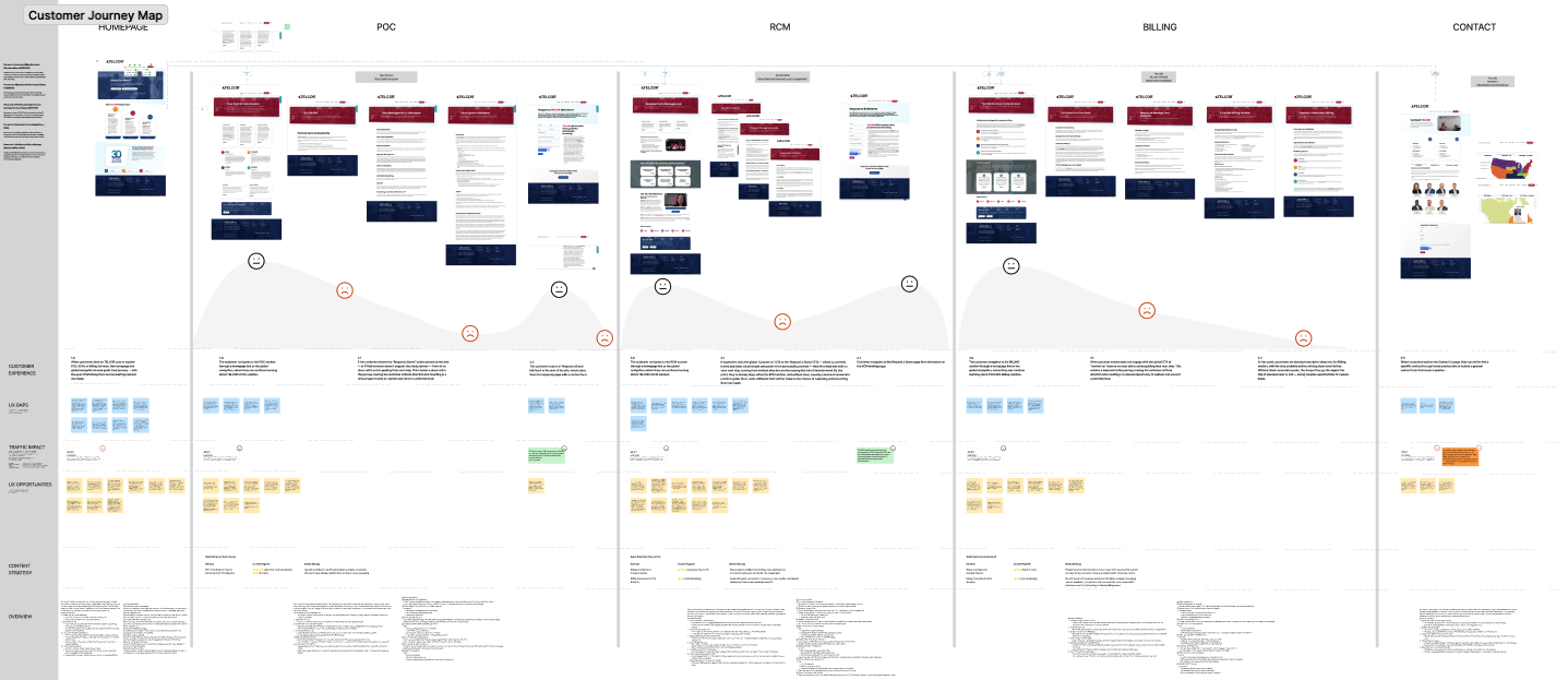
The work didn't start with a redesign. It started with research. By the time wireframes were being drawn, every decision had three or four pieces of evidence behind it — VOC quotes, GA4 numbers, competitor comparisons, persona pain points. That's how you build a website that earns trust on first contact.
This is the methodology I bring to every Revenue Website Sprint — compressed when budgets and timelines require it, expanded when the business demands the deeper read. Same rigor, different scope.