
Virtuactive: From Brand Confusion to Persona-Driven Clarity
Virtuactive had everything offline that didn't translate online. Word-of-mouth was strong. Builder relationships were deep. They'd designed over 5,000 homes nationwide. But the website was undermining all of it.
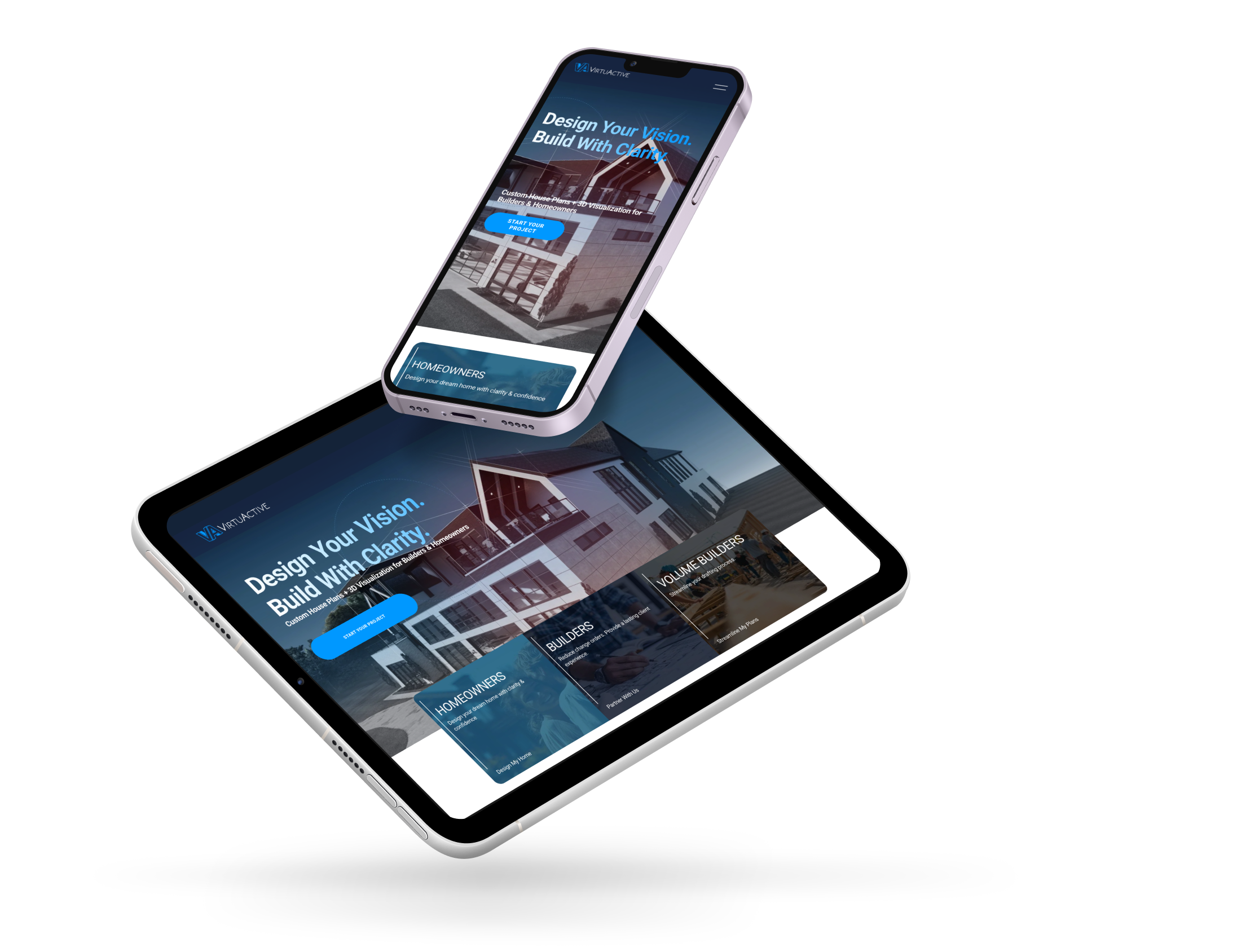
The homepage held visitors for an average of 12 seconds before they bounced. Mobile traffic was the majority — and it had the highest drop-off rate. The hero treatment led with 3D visualization, which created a brand identity problem visible in plain text: most first-time visitors thought Virtuactive was a 3D company. Leadership had a sharper version of it in our discovery interviews — "We're not a 3D company. We're a design company that happens to do 3D."
The site was speaking to four different buyer personas — Homeowners, Remodelers, Custom Builders, and Volume Builders — through one generic flow. Dual CTAs ("Let's Get Started" vs. "Need More Direction?") created friction instead of clarity. The "Shop Online Plans" section got top billing in the navigation despite poor conversion. And the Volume Builder offering — which leadership identified as a potential 5–6x business growth opportunity — was buried under generic service tabs.
The site wasn't dated. It was misaligned with the business it was supposed to represent.
The issue wasn’t aesthetics. It was a disconnect between energy and conversion.
VirtuActive had a visually strong presence, but the experience wasn’t translating that energy into action. The site leaned heavily on visuals and movement, but didn’t clearly anchor users in what the product was, who it was for, or how to take the next step. Key moments lacked direction. Messaging didn’t do enough work to support the visuals, and calls to action felt secondary instead of intentional. For a product built around engagement and momentum, the experience was asking users to interpret too much on their own. When clarity and guidance are missing, even high-interest users hesitate or drop off before converting.
What changed
Six structural shifts, every one defended by research and data:
From brand confusion to clear positioning. Hero copy now states what Virtuactive actually does: "Custom House Plans + Optional 3D Visualization for Builders & Homeowners." No more 3D-first framing. Design is the headline; 3D is the add-on.
From generic flow to persona pathways. Homepage prompt ("I'm a Homeowner / I'm a Builder / I'm a Remodeler / I'm a Volume Builder") routes each visitor into content built for their specific decision criteria.
From dual-CTA friction to single confident action. Replaced competing CTAs with one persistent "Get Started" anchored across the site, plus inline persona-specific micro-CTAs ("Customize This Plan," "Talk to a Designer").
From buried trust to surfaced proof. Added "Why Builders Choose Us" section with builder logos, success metrics, and project volume callouts (5,000+ homes designed nationwide, 10+ years of trusted builder partnerships). Moved testimonials into key flow pages — not just a dedicated testimonial page.
From cluttered nav to streamlined IA. Killed the "More" junk drawer. Renamed vague labels. Consolidated 3D content into one benefits-focused page. Built breathing room for the Volume Builder vertical with its own dedicated landing.
From mobile-broken to mobile-first. Progressive disclosure on mobile navigation. Sticky CTAs anchored to mobile viewports. Compressed assets and leaner structure for faster mobile load.
Why this matters
A 12-second engagement time on a luxury home design site isn’t just a website issue. It’s a positioning gap showing up through the website. VirtuActive’s reputation, builder relationships, and 5,000+ homes designed were all real, but the site was telling a smaller story than the business had earned. Most of that friction showed up immediately in the first sentence on the homepage and the competing calls to action beneath it.
The work didn’t begin with redesign. It started with a single leadership conversation that surfaced a core tension in the brand: “we’re not a 3D company, we’re a design company that happens to do 3D.” That was paired with one clear signal in Google Analytics 4, the 12-second engagement time, which quantified the cost of that disconnect. By the time wireframes were developed, each decision was grounded in data, persona insight, or language pulled directly from stakeholders.
This is the same approach behind every Revenue Website Sprint. Start with research, move to focused recommendations, then execute with intention. The rigor stays consistent whether the engagement is $7,500 or $15,000. The only thing that changes is how tightly it’s delivered within the timeline and budget.